
38 maps that explain the global economy
by Matthew Yglesias on August 26, 2014
Commerce knits the modern world together in a way that nothing else quite does. Almost anything you own these days is the result of a complicated web of global interactions. And there's no better way to depict those interactions and the social and political circumstances that give rise to them than with a map or two. Or in our case, 38. These maps are our favorite way to illustrate the major economic themes facing the world today. Some of them focus on the big picture while others illustrate finer details. The overall portrait that emerges is of a world that's more closely linked than ever before, but still riven by enormous geography-driven differences.
World GDP per capita
World GDP per capita
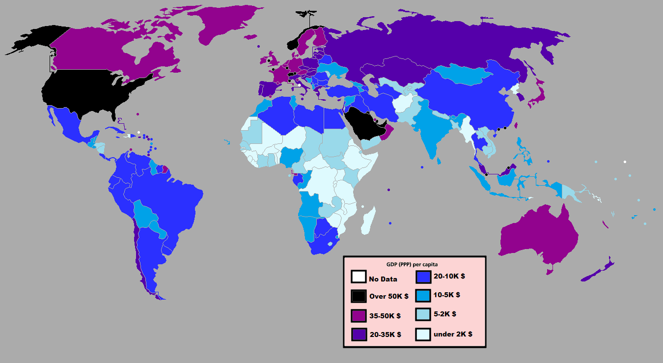
GDP per capita isn't a perfect proxy for living standards (it doesn't consider inequality, for example, or the fact that the weather is way nicer in Spain than Denmark), but it's the best quick summary measure of economic capacity that we have. The United States is in the top tier by this measure, joined by a bunch of much smaller countries. The next bracket down includes Japan and several large European countries. But the two largest-population countries, China and India, are much poorer than that, and the very poorest countries are largely clustered in Africa. These days, though, the number of poor people living in this poorest tier of countries is actually smaller than the number of poor people living in not-quite-so-poor places like India.Economic centrer of gravity map
 McKinsey
Economic centrer of gravity map
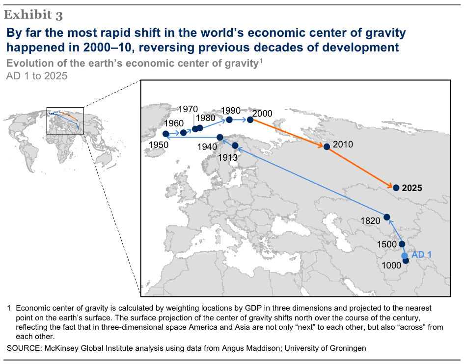
The consulting firm McKinsey made this map based on Angus Maddison's historical data to show the world's "economic center of gravity" over time. The map plots the center point in three-dimensional space, which renders the north-south aspect somewhat less interesting, but the east-west movement over time is fascinating. A thousand years ago, economic activity was centered near the middle of the Eurasian landmass. By the early 20th century, the Industrial Revolution in Europe and the growth of the United States pulled the center way to the west. But since 1980 or so, Asia has been growing faster than the US and Europe and dragging the middle back to where it was centuries ago. By 2025, McKinsey thinks the global economy will once again be balanced around the middle of Eurasia.World light map
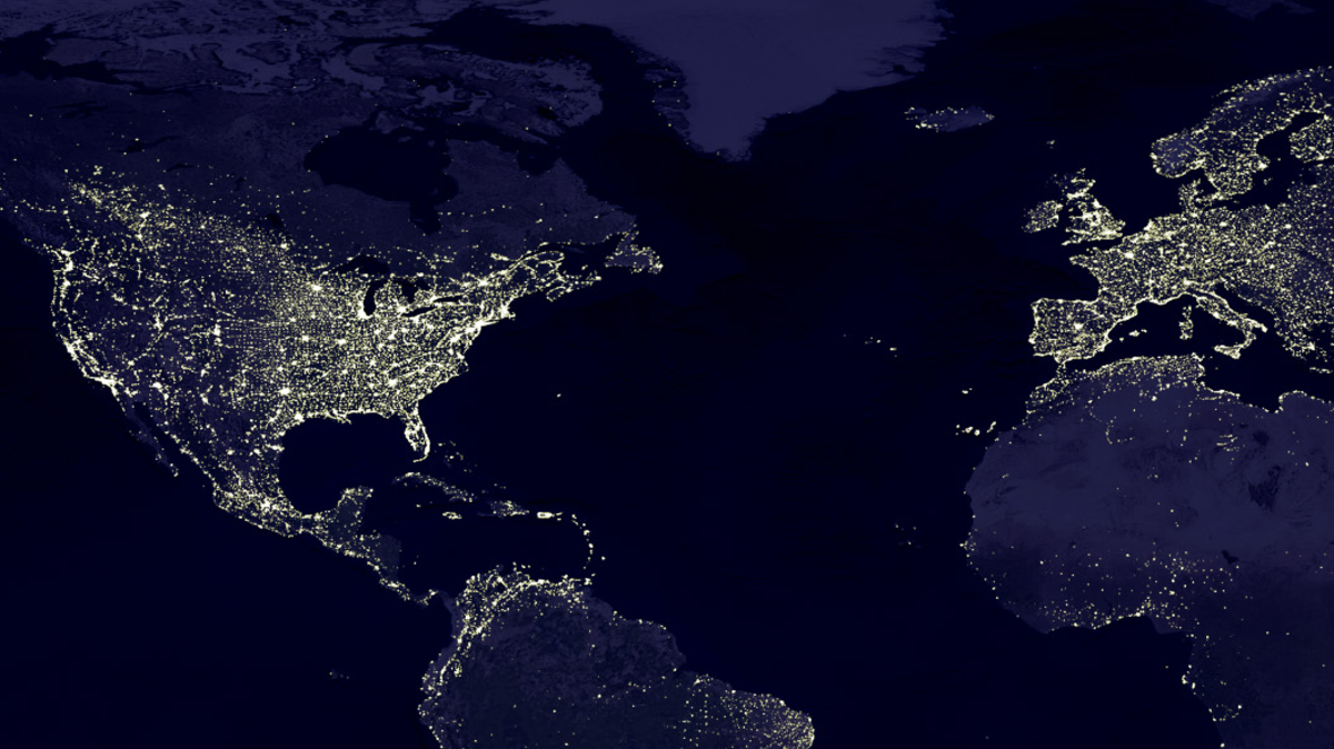
World light map
Economic activity is abstract and, in many ways, hard to measure precisely. Something cruder, like this satellite image of the world at night, in some ways does more to visualize it than any number of more official indicators possibly could. What you see is that in rich countries, light is largely a proxy for population density. Observe the thick cluster of the US Northeastern Megalopolis and the even bigger cluster in northwestern Europe. In poorer regions, however, the map represents not just population density but also the actual availability of electrical lighting. Huge swathes of Africa are barely illuminated at night, and densely populated India looks rather dim.The century-old deal that drives the Fed
The century-old deal that drives the Fed
The Federal Reserve System in the United States of America is the world's most important central bank, and a key driver of economic conditions around the world. As revealed by this map, it's also a product of America's cumbersome political system, characterized by a mixture of crass dealmaking and status quo bias. At its founding before World War One, the Fed was divided into 12 geographically defined districts, and the apportionment of the country has never been revisited. Consequently, the enormous 12th District covers everything west of the Rockies, while the 3rd and 4th Districts cover relatively tiny slices of the northeast. Meanwhile, the state of Missouri contains two different Federal Reserve banks, because a Missouri senator was important to getting the bill through Congress.Korea at night
Korea at night
Another look at the earth at night, this time zoomed in on the Korean peninsula. Political institutions aren't the only thing that drives prosperity, but this light map shows what a big difference they can make in extreme cases. The northern and southern portions of the peninsula have a largely shared history, language, culture, cuisine, and ethnic identity. But since the conclusion of the Korean War in the early 1950s, they've pursued very different institutional courses. Consequently, the south is lit brightly at night, with crowded, prosperous cities. The north looks like it could be devoid of human population. But really it's devoid of the kind of infrastructure and fuel that would allow its residents to stay out of darkness.Unemployment in Europe
 Eurostat
Unemployment in Europe
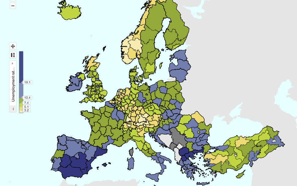
This map shows the different unemployment rates in different parts of Europe broken down by region rather than by country. It underscores the difficulty that European policymakers have in forming an appropriate response to the continent's economic woes. A monetary policy that's stimulative enough for Spain and Greece would badly overheat Austria and the Netherlands. At the same time, European countries themselves are divided. Northern and southern Italy look quite distinct, and the former East Germany looks a lot more like Poland than it does like the rest of Europe.Africa's mobile banking leap
Africa's mobile banking leap
Sub-Saharan Africa is, famously, poorer than other regions on earth. But in certain key areas, that relative under-development may allow the area to leapfrog technologies used elsewhere. Leo Mirani's map of countries where mobile phone-based payment systems outnumber traditional banks underscores the point. Mobile phone infrastructure is actually simpler to build than traditional landline phones, so in most of Africa mobile phone penetration actually spread faster and further than traditional wireline phones. And because most Africans never had access to traditional bank accounts, there are no powerful incumbent interests keeping people locked in them. Almost everyone thinks the mobile payments revolution will come to America someday, but it's already arrived in much of Africa and will come to dominate that continent before any other.The deep ties between Europe and Russia
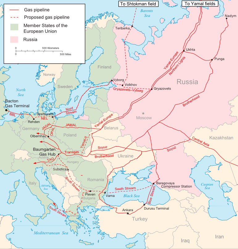
The deep ties between Europe and Russia
Russia and the European Union are locked into an intimate economic relationship by the web of gas pipelines depicted in this map by Samuel Bailey. On the one hand, without the gas that flows through these pipelines, many European countries — including Germany and Italy — would be bereft of energy resources. And yet as critical as Russian fuel imports are to Europe's energy mix, those very same exports are in a way even more critical to the Russian economy, as they offer a huge share of the country's foreign currency earnings. As events in Ukraine and elsewhere drive tensions between Moscow and Brussels, both sides remain locked into this energy trade by the basic geographical reality that gas can only flow where the pipelines go.How sugar circulates globally
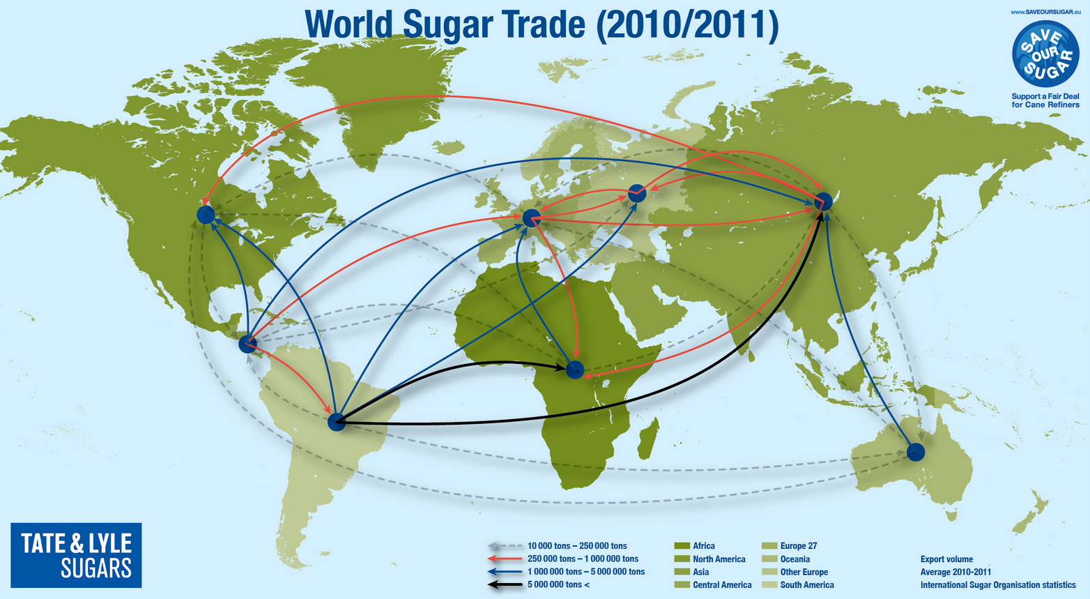
How sugar circulates globally
Sugar isn't necessarily the most important commodity in the world, but it is one of the most widely consumed and delicious. This map illustrates the global pattern of sugar imports and exports — a surprisingly complex web that reveals the ways in which the real-world pattern of global trade is considerably more tangled than a basic model of specialization and comparative advantage would suggest. On balance, of course, some regions import more sugar than they export and others are the reverse. But on a gross basis, all regions both import and export sugar, forming a complicated global supply chain. Public policy influences this dynamic. The United States imposes quotas on the total amount of sugar that can be imported from any given country — thus producing financial gains for America's beet sugar farmers. This prevents our domestic market from soaking up all of Latin America's considerable production and diverts much of it abroad to sugar-hungry markets that are less convenient to ship to.World export map
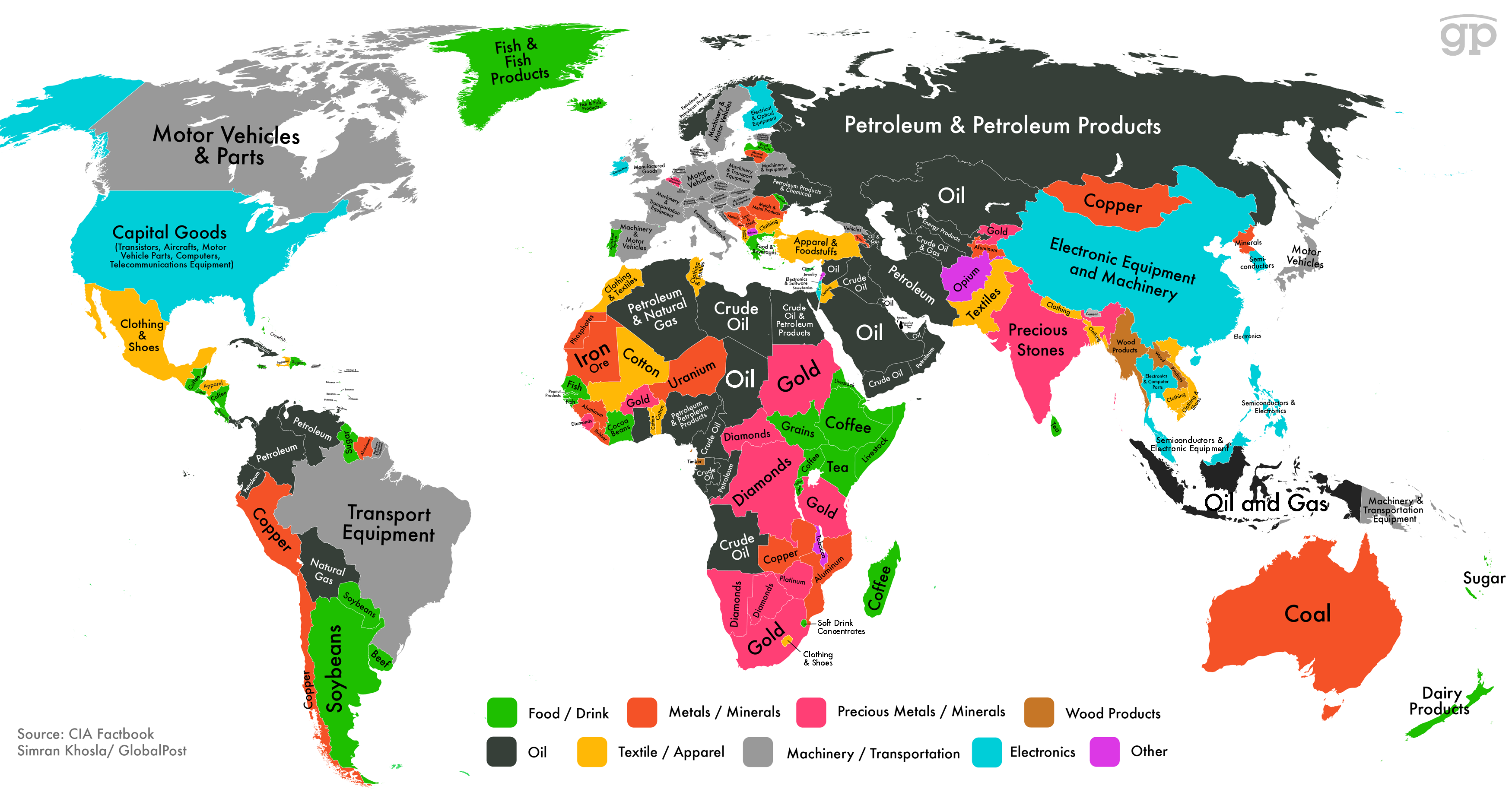
World export map
This map from Simran Khosla charts each country's biggest export category, and also color-codes the categories into larger groups. Countries that depend on metal or mineral exports are typically quite poor, with the dominance of these sectors generally a tell-tale sign of a lack of any kind of sophisticated industrial base. There are, however, exceptions. Australia enjoys one of the world's highest living standards, notwithstanding a global trade balance driven by coal and other minerals, while copper-oriented Chile is Latin America's richest country. The black-colored oil exporters are an interestingly diverse group. The richest countries in the world — places like Norway and Qatar — fall into this category, but so does middle-income Russia and desperately poor Chad.Busiest container ports
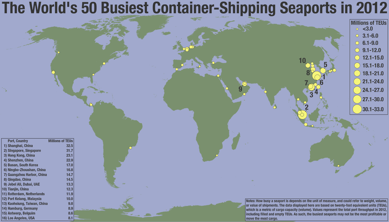
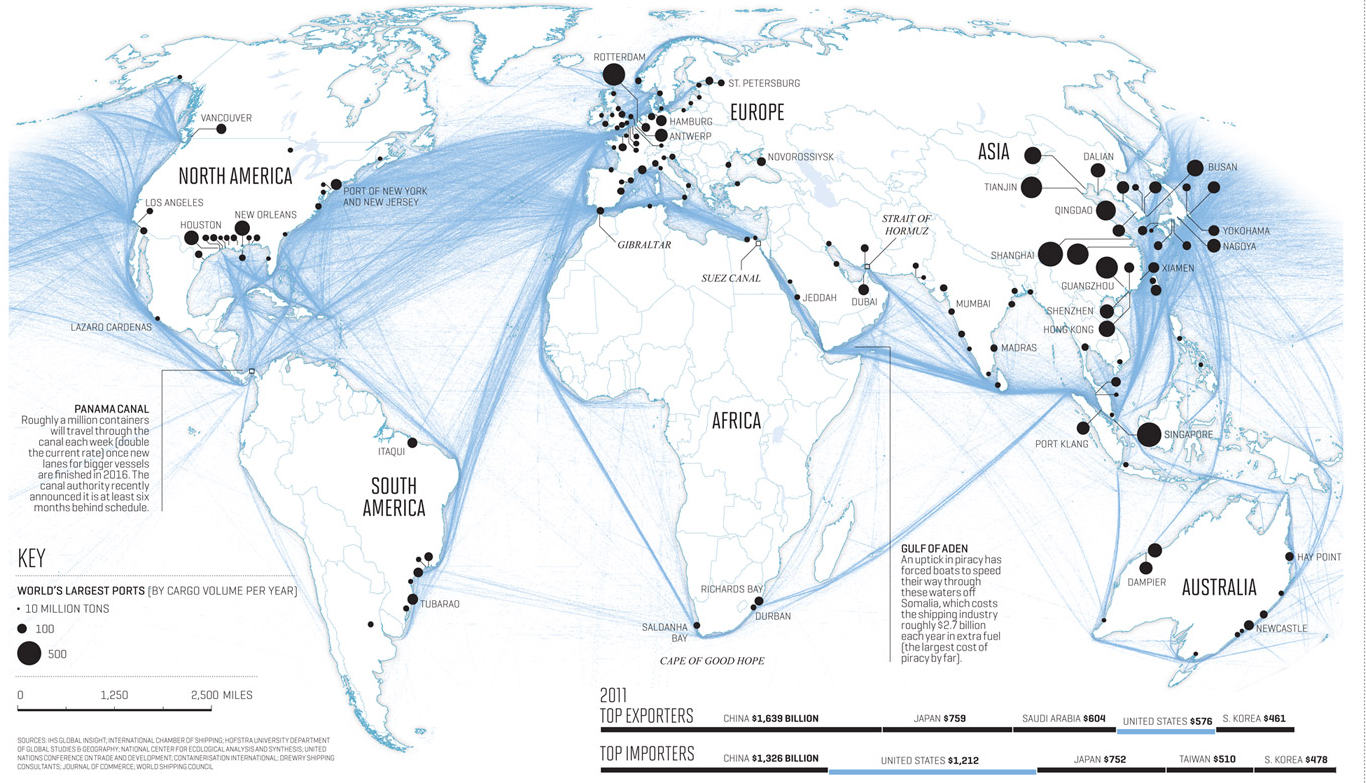
Busiest container ports
Seaports are a physical manifestation of the global trade of goods. This Seth Kadish map shows the locations of the 50 busiest on the planet, and the size of the dots is scaled to the quantity of goods they handle. The heavy concentration of shipping activity on Asia's Pacific Coast is a striking symbol of both East Asia's enormous population and its outsized role in the global manufacturing sector. India and Africa, meanwhile, are visibly suffering from a chicken and egg problem of underdevelopment. They lack the kind of factory growth that would provide economic opporunities for their people and justify the creation of busy ports. At the same time, they lack the kind of infrastructure — including high quality container ports — that would support rapid growth of manufacturing.World trade is more important
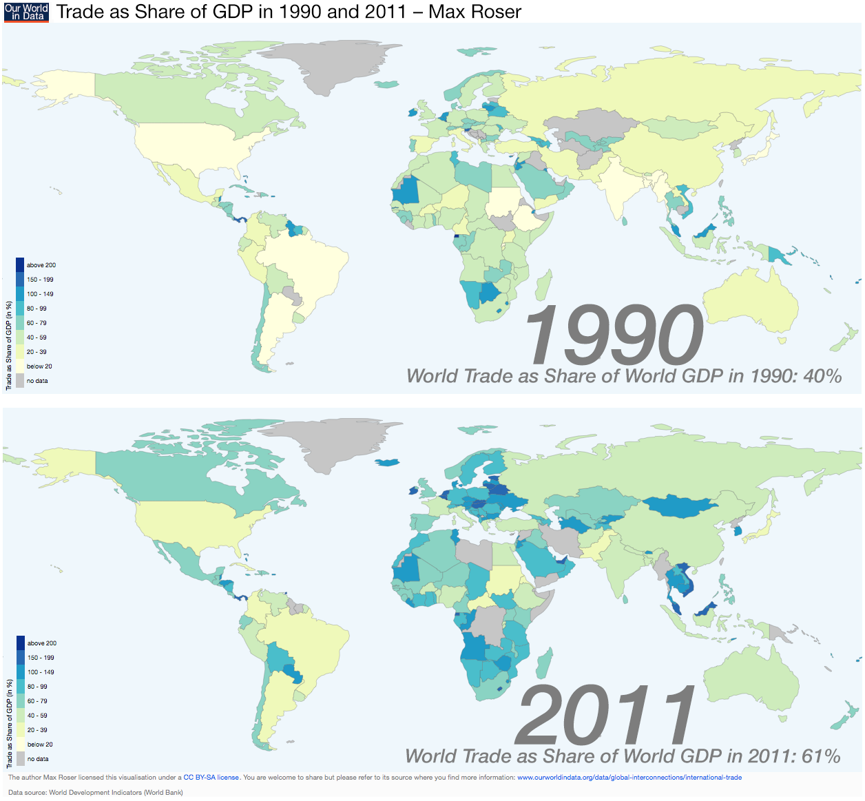
World trade is more important
This map by Max Roser shows the volume of trade each country conducts relative to the size of its overall economy. A big country like the United States tends to have a lower trade share than a small country like the Netherlands. But what's really striking here are not the differences between countries, but what they have in common. With the exception of a handful of countries under trade sanctions or major wartime disruptions, trade has risen in significance for every country on the planet. Improved technology, the absence of big-picture geopolitical rivalries, and policy reforms have all combined to put global trade on a rapid upward path — one that so far shows no sign of halting.World shipping routes
World shipping routes
Nicholas Rapp made this beautiful image of global shipping routes, highlighting the sinews of commerce in the modern age as global trade has boomed to unprecedented levels. Trade as a share of world output fell precipitously during the two world wars, and Cold War politics kept it relatively low for most of the second half of the twentieth century. But over the past generation it's boomed, thanks to a combination of changed policies and the invention of the container shipping. Something the map highlights is that the world economy features a couple of major shipping choke points — one around Malaysia and Singapore and the other around the Red Sea — where geopolitical instability could produce major disruptions to commerce. At the moment, a de facto American monopoly on ability to sustain far-flung naval operations prevents this from happening, and it wouldn't really be in anyone's interest to massively interrupt world trade, anyway. Then again, World War I wasn't really in anyone's interest either.World's longest flights
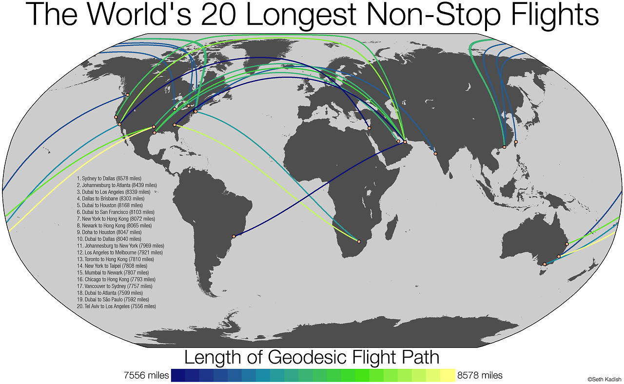
World's longest flights
Air travel has been revolutionizing the world economy since its initial commercialization in the middle of the twentieth century. More recently, gains in fuel efficiency have made it possible for airlines to serve essentially any city-pair on the planet with direct air service, as long as the market exists for it. Seth Kadish made this map illustrating the twenty longest routes with regular passenger service in the world today. Strikingly, four of the top 10 and six of the top 20 involve the relatively small city of Dubai in the United Arab Emirates, with nearby Doha, Qatar accounting for several more entries on the list. These Gulf states have invested heavily in building up their own national airlines to connect themselves to the global centers of commerce, and the airlines that have resulted are now transforming the aviation industry with low labor costs and a high standard of service.Pearl River Delta Megacity
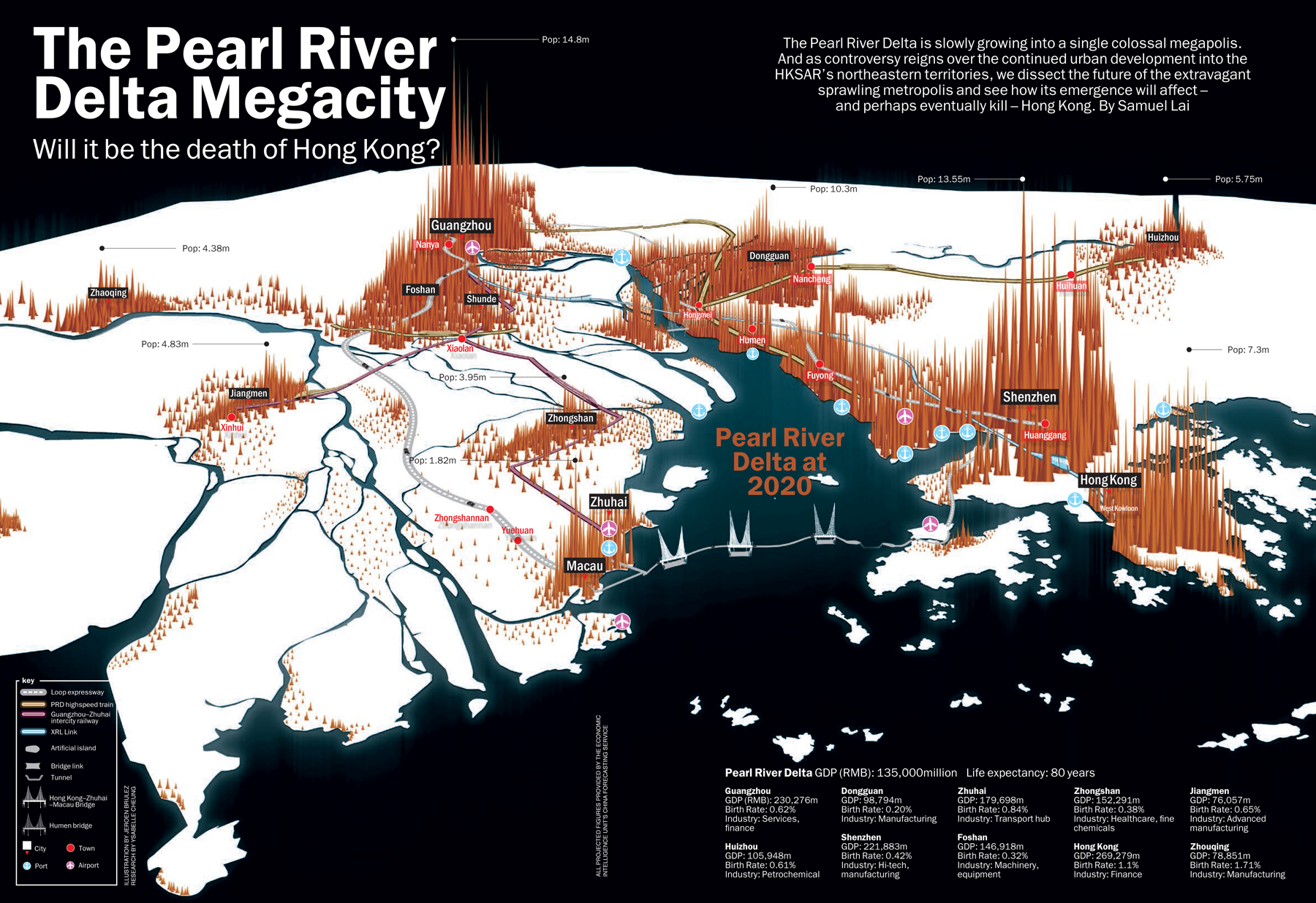
Pearl River Delta Megacity
Hong Kong and Macau, at opposite ends of the bay, formed where the Pearl River drains into the South China Sea, were, for decades, islands of foreign rule hovering on the edges of Maoist China. This left them substantially more prosperous than the Chinese mainland, and when China began its economic reforms in the 1980s, it was the area north of Hong Kong that led the way. As the foreign colonies have been partially reintegrated into China proper and the process of growth and reform has continued throughout the mainland, the broad arc from Hong Kong through Shenzhen into Dongguan, Guangzhou, Foshan, Zhongshan, and Macau has emerged as a key hub of global shipping and manufacturing. Ongoing growth of the mainland cities combined with the Chinese government's massive investments in transportation infrastructure are knitting the region together into what could soon emerge as a "megacity" — a gigantic, polycentric metropolitan area with over 100 million inhabitants.Silicon Valley
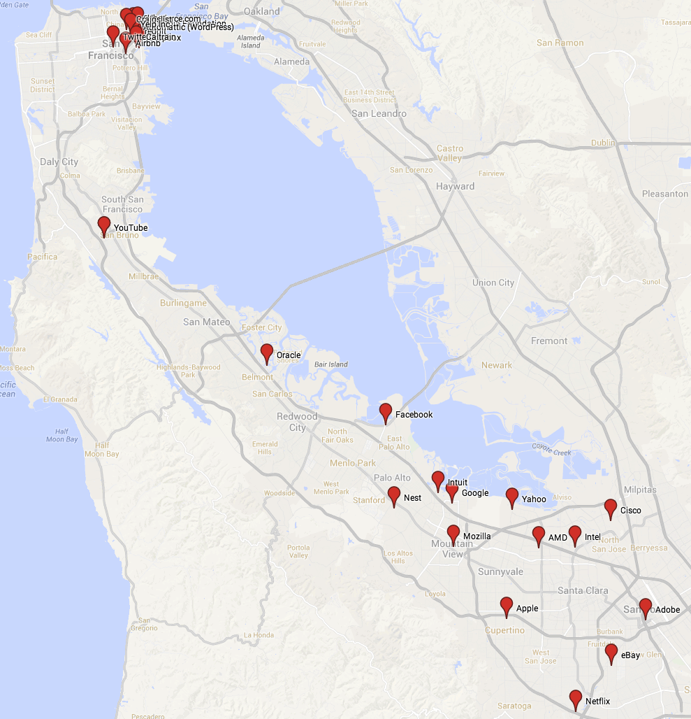
Silicon Valley
California's Silicon Valley, the arc of towns stretching between San Jose in the south and San Francisco in the north, is the unofficial capital of the global computing industry. Far from making geography obsolete, the internet has in some ways made it more important than ever. The best engineering talent generally wants to live where the top employers of software engineers are located. And any company that wants to hire loads of top computer programmers needs to be present in the Valley to recruit them. Meanwhile, one major source of venture capital financing for new startups is rich tech company founders who've already cashed out. And regardless of origin, top VCs like to locate where both startups and potential buyers of young companies are thick on the ground — Silicon Valley. Yet, while past technological revolutions have led to explosive urban growth, the impact of the technology boom on the Valley has been different. Strict zoning rules have prevented the vast suburban areas from urbanizing, and already-dense San Francisco is resistant to becoming even denser. The result has been skyrocketing housing prices that have created windfalls for people who bought property at the right time but that make it difficult for working-class people to share in the Bay Area's growing prosperity.Verkehrsverbund Rhein-Ruhr
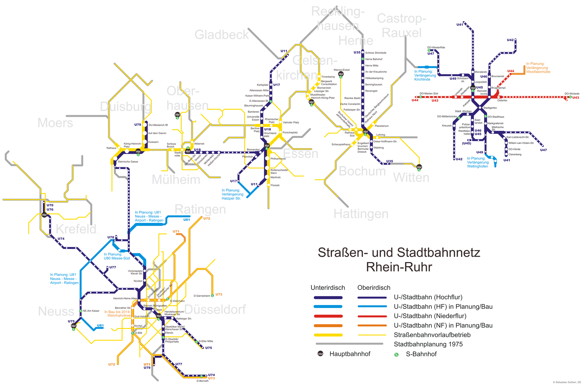
Verkehrsverbund Rhein-Ruhr
Germany is Europe's largest economic power, and Berlin is Germany's largest city. But the real hub of the Germany economy is a lesser-known but more interesting urban phenomenon — the polycentric metropolitan area known as Rhine-Ruhr, stretching from Dusseldorf and Cologne in the north to Bonn in the south. None of the constituent cities of Rhine-Ruhr are especially large, but together they make a metropolitan area that's 11 million strong and hosts 26 of Germany's 50 largest companies. Knitting it all together and making it all work is the complicated but efficient Verkehrsverbund Rhein-Ruhr, the region's mass transit system. It's composed of 29 regional rail lines, 11 S-Bahn lines, 19 light rail lines, 45 streetcars, and over 900 bus routes.Income segregation in Greater Washington
Income segregation in Greater Washington
This Pew Center map showing high-income versus low-income areas in the Washington, DC, area is noteworthy, not because it's exceptional, but because it's so very typical. Social and economic divides aren't new, of course, but their tendency to track large-scale geographic spaces is. In an earlier age, a typical rich person might live on an estate surrounded by servants and farmers. In a city, the well-to-do might enjoy garden apartments while the poor crowded immediately upstairs in crammed walkups. But the car, the elevator, and the mechanization of farming have created a new geography of class around the world. Now the rich tend to cluster with each other in towns and neighborhoods that possesses desirable public amenities ("good schools," nice parks, sound transportation infrastructure) and class-appropriate retail opportunities.Why travelers visit USA
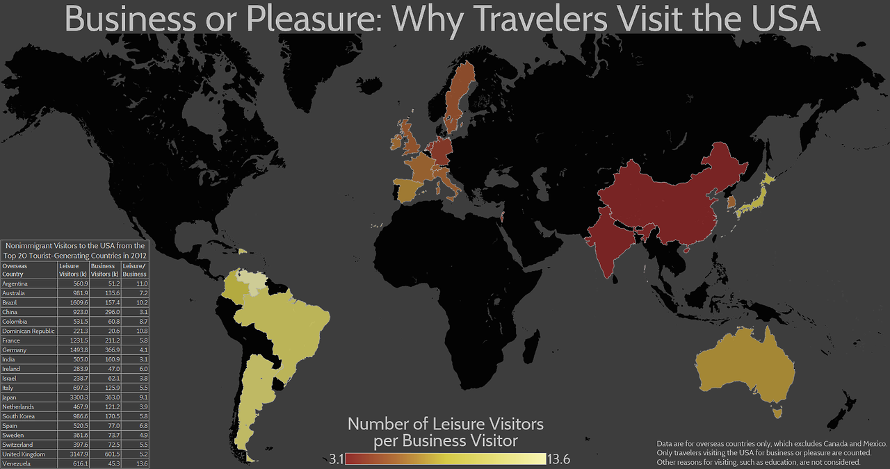
Why travelers visit USA
The United States of America is a common destination for both business and leisure travelers from all around the world. But how the US figures into foreigners' travel plans varies considerably from place to place. In this map, Seth Kadish plots the ratio of vacationers to business travelers from all origins outside of North America. We see here that hotels looking to court business travelers would do well to invest in Chinese language capabilities, but tourism-oriented ones may be able to do without. By contrast, Japanese and Latin American visitors are largely coming to our shores for pleasure rather than work.Transatlantic telegraph cable
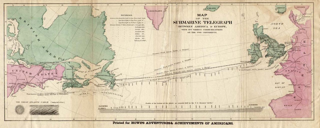
Transatlantic telegraph cable
In 1858, Cyrus West Field and the Atlantic Telegraph Company completed the first telegraph cable across the Atlantic ocean. Queen Victoria sent a congratulatory message to President James Buchanan in a matter of minutes, when a message used to take about 10 days by ship. The first cable proved structurally unsound, and it was not until the 1870s that a really robust transatlantic cable system was put in place. The technology involved is, of course, obsolete today. But as we are living through a revolution in information technology, it's worth reflecting on the even more drastic improvement in communications that was achieved by 19th-century telegraphs.Oil import/export map
Oil import/export map
BP's Statistical Review of World Energy includes this map of global trade flows of oil. One key point here is that some countries you don't think of as major oil exporters — Brazil, for example — are actually playing an important role in the global supply chain. Another is that contrary to a lot of simplistic political rhetoric, the United States doesn't actually import much oil from Saudi Arabia or other Persian Gulf countries. We have a fair amount of domestic oil production, Canada and Mexico both export oil, and both the North Sea and western Africa are closer to us than is the Persian Gulf. The Gulf nonetheless matters to the United States, because its oil supplies matter so much to Europe, China, Japan, and India. Oil can be shipped pretty far and wide, so disruption to any major supplier-consumer relationship pushes up the global price of oil and puts a major damper on the living standards of highly oil-dependent societies such as ours.World pigs map
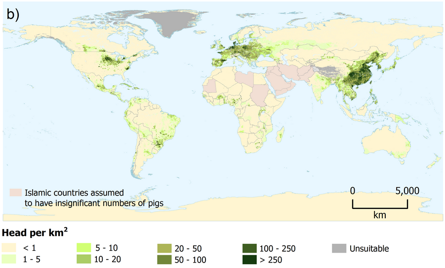
World pigs map
Timothy Robinson and his co-authors put together a series of maps showing the global distribution of various widely eaten animals. This map shows where the world's pigs live, and makes the point that the taste for delicious pork varies widely around the world. North Americans, Europeans, and Chinese people all eat pigs, but China's enormous population and the relatively low cost of pork make it the clear leader in global pork production. Meanwhile, Latin America and Africa seem broadly pig-averse, as is (of course) the Muslim world. The lack of pigs in India — a country with many vegetarians and many Muslims — is also noteworthy, though you see that in northeastern India, where there are more cultural ties to southeast Asia, there are some pigs.World fisheries yield
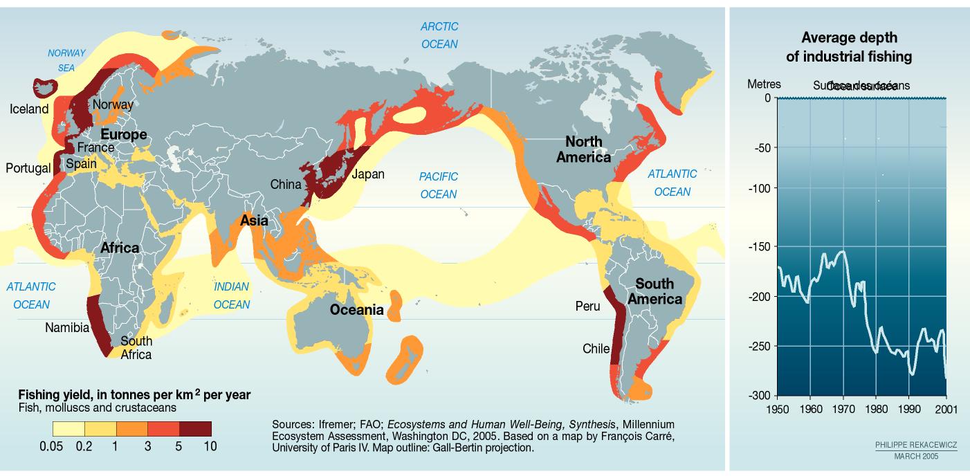
World fisheries yield
Commercial fishing is an interesting modern link back to certain key aspects of the pre-agricultural economic paradigm. Nobody owns the ocean and nobody owns the fish it contains. Unfortunately, when you combine this traditional approach to property rights with state-of-the-art technology, you get a tragedy of the commons — everyone grabs as much fish as they can, and the long-term productivity of the fishery declines. This UN Environmental Program map of global fishing yields shows that we are pulling an awful lot of fish out of most coastal waters. At the same time, the average depth is falling as the most promising fisheries fall prey to overfishing. The good news is that policy solutions are available and, where implemented — as in many US fisheries — they are working.Shale oil/gas
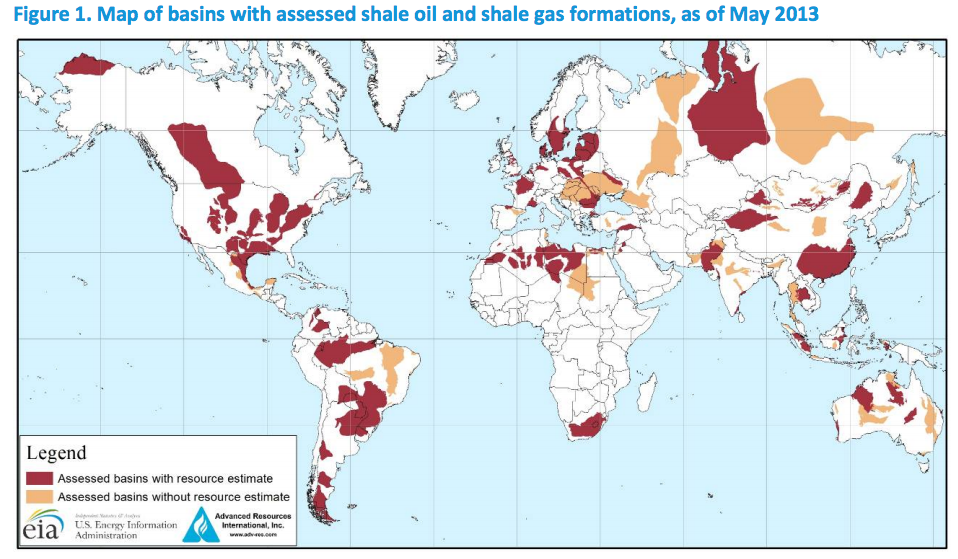
Shale oil/gas
Shale oil and gas obtained through fracking and other new extraction techniques have transformed the regional economies in several different parts of the United States. But while the USA is the world leader in shale extraction, we're hardly the only country thought to have significant recoverable reserves. This map from the US Energy Information Agency shows the current best thinking on where there's fossil fuel to be found. In much of Europe, environmental concerns have prevented this shale from being tapped, while other countries don't yet have the technology and know-how to do it.Total fertility rate
Total fertility rate
Total fertilty rate — the number of children the average woman has in her lifetime — is trending downward almost everywhere, but it exhibits considerable variation from place to place. A key fact is that countries with TFR at two or below will see population decline in the absence of new infusions of people via immigration. Almost every rich country now finds itself in such a position, which is leading to increased salience of immigration issues. The exception, interestingly, is France, which has built — at considerable expense — what are probably the most generous and family-friendly social policies around.Most people live in this circle
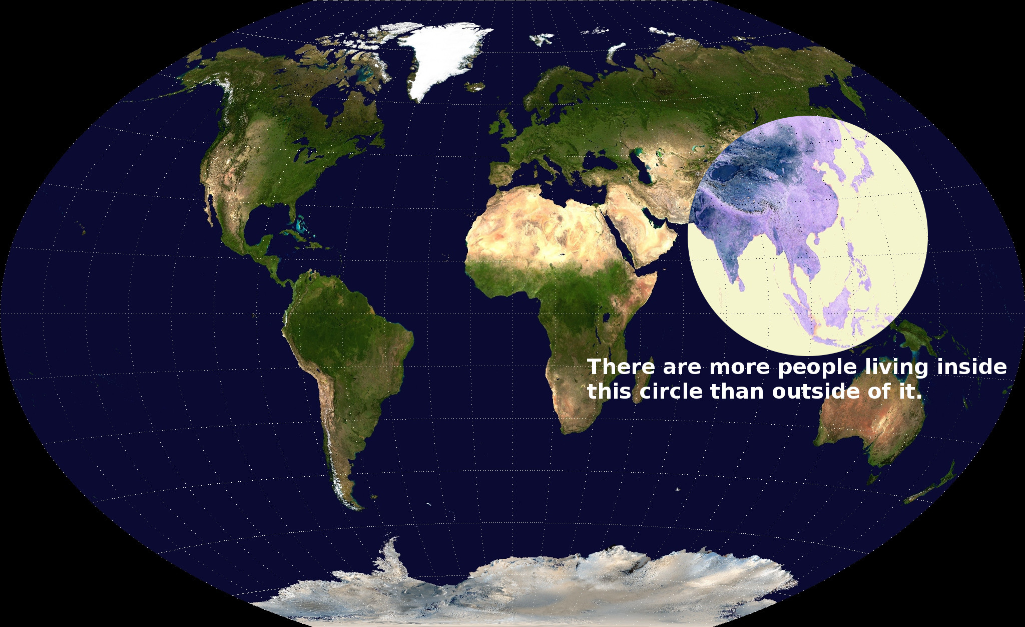
Most people live in this circle
This map serves as a dramatic illustration of how much more densely populated south and east Asia are than the rest of the world. This, in turn, is a legacy of economic systems that existed centuries ago. Rice cultivation, popular in this region of the world, generates many more calories per acre than are yielded by traditional agricultural practices elsewhere. Modern technology means that the world's population no longer has to be distributed according to where rice is cultivated. But the higher population density of the traditional rice-growing areas persists to this day nonetheless. Over time, migration and differential birth rates may level things out.Megacities
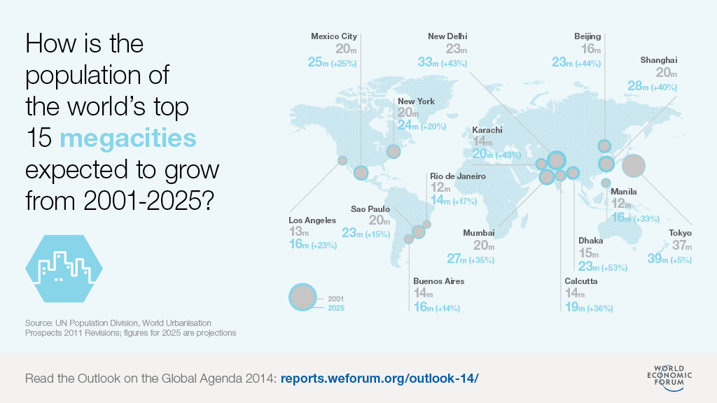
Megacities
We are living through an era of massive urbanization in many of the largest-population cities of the world. This map from the World Economic Forum charts the world's biggest metropolitan areas and forecasts their likely growth from 2001 to 2025. Big developed cities like New York and Tokyo are projected to keep growing, but the biggest gains will be in Asia and especially South Asia, where Dhaka, Calcutta, Mumbai, New Delhi, and Karachi are all forecast to achieve startling levels of growth. Given China's massive population it is in a sense surprising that Shanghai and Beijing are projected to stay clearly smaller than the world's very biggest cities. This is a matter of deliberate policy choice by the Chinese government, which has decided for reasons largely related to internal security that it wants to prevent too many people from moving from the countryside into the PRC's leading cities.Maternity leave
Maternity leave
Women in all societies give birth, and parents in all societies raise children. But as this excellent map made for National Public Radio by Alyson Hurt, Erin Killian, and JoElla Straley illustrates, different countries have made very different policy choices about how to recognize these realities with mandatory maternity leave. The most parent-friendly countries are an interesting mix of Nordics and Balkans, with the UK and Australia thrown in. The United States lags behind Canada, Japan, and all of Europe.World billionaires map
World billionaires map
We're living in an era of hyper-inequality that's made ours the Age of the Billionaire. This map shows where the world's richest people live — most of all, in the United States of America, which has far and away the world's largest concentration of billionaire wealth. Of course, we are also home to the world's largest overall economy. It's more instructive, in many ways, to compare countries that are similar in terms of overall GDP. Russia and Italy, for example, have approximately the same aggregate levels of national output, but Russia massively outpaces Italy in terms of billionaire wealth. Indeed, billionaire-dominated Russia manages to have more billionaire wealth than places like China, Japan, or Germany that have much more overall economic activity.Unimmunized children
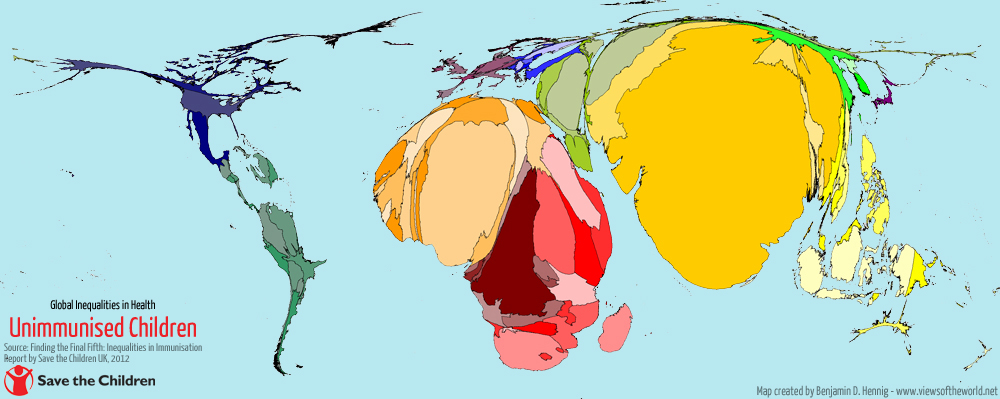
Unimmunized children
Vaccines are great. Tragically, not every child gets them. This map by Benjamin Hennig reveals that the problem of unvaccinated children is largely concentrated in India and Africa, with India a particularly striking case of a country where economic growth has not yet delivered much in the way of public health gains. But though the numbers of the unvaccinated in countries like the United States are much lower, in a way that reveals a much more troubling policy failure. Here, the resources to vaccinate everyone are clearly present. When vaccination doesn't happen, it's because of misinformation about the risks and public policy that indulges that misinformation.Income cartograph animation
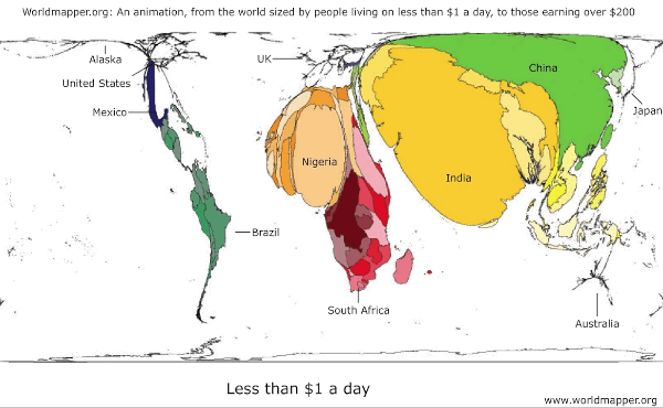
Income cartograph animation
This handy animation rescales the size of each country to depict the number of people living there at any given income level. Then it runs up the income chain, from the poorest of the poor to the affluent. It highlights that even though many more people live in India than live in Germany or France or Japan, India contains many fewer affluent people than those countries. These kind of considerations are crucial to major global firms trying to understand where their biggest market opportunities are. Some goods can expect stellar sales in China, while others are still too pricey for the mass market there. The United States' combination of scale and affluence makes it far and away the best single country for products targeting relatively high-end consumers.China GDP map
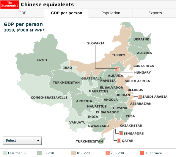
China GDP map
China is so vast that it can be difficult for foreigners to even begin to get their heads around it. This map from the Economist is very helpful in illustrating the real situation that lies behind the enormous aggregates. A handful of coastal Chinese cities are genuinely rich on a par with Gulf oil states. But most of coastal China is more middle-income, comparable to countries in Central Europe. Much of the interior, meanwhile, is still genuinely poor with living standards like what you would find in India, the poor parts of Central America, or, for some provinces, even in sub-Saharan Africa. Add this all up and you get the world's second-largest economy. But outside of those shining coastal cities, China remains far behind the West in terms of wealth.Rio vs Shanghai metro map
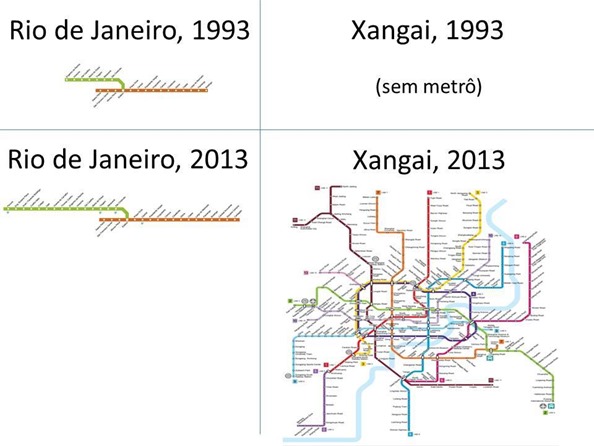
Rio vs Shanghai metro map
China and Brazil are both large countries (of course, China is bigger) with roughly similar levels of income per capita. But over the past decade, China has grown much faster than Brazil, and almost all observers expect that to continue. This comparison of metro maps in Shanghai and Rio helps illustrate why. Both Brazil and China mix market economies with extensive government involvement, but China's public spending features a heavy tilt toward investments in infrastructure. Brazil spends more on civil service salaries and transfer payments. That Brazilian approach has considerable appeal in terms of lifting incomes in the short-term, but it means that Chinese spending is continually laying the groundwork for new opportunities and future economic growth.GDP / population
GDP / population
The International Monetary Fund devised this handy graphic for summarizing economic output around the world. Each country is depicted as a rectangle, with the overall size of the rectangle representing the overall size of your economy. But two similarly sized rectangles can have very different shapes. A tall and skinny rectangle like Germany represents rich countries with not that many residents. A short and squat rectangle like Nigeria represents a country with many residents and a very low average standard of living. We also see here that the global income distribution is quite unequal, with around 75 percent of the world's population living in countries that are below the global average income.Open defecation in India
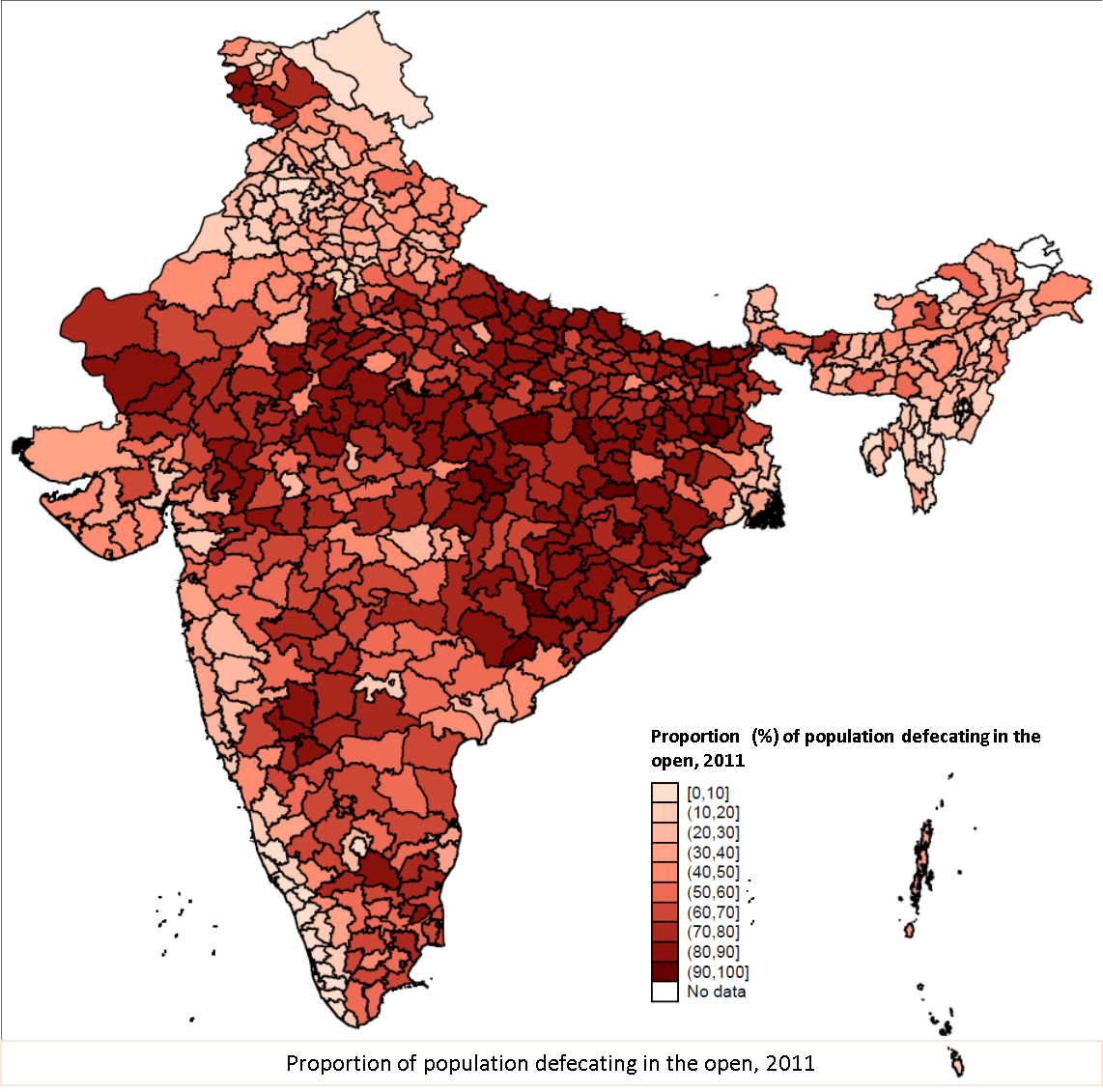
Open defecation in India
India is the world capital of "open defecation" (i.e., not using a toilet), a problem that new Prime Minister Narendra Modi has vowed to tackle. As this map shows, open defecation is both very common across a large swath of India and also something that varies quite a bit from region to region. The problem is in part one of basic infrastructure. India is far from being the poorest country in the world, but it is home to approximately 60 percent of the world's toilet-less population. Given India's dense population, open defecation is a major public health problem, with feces inevitably contaminating drinking water. This leads to intestinal disease and contributes to India's high rate of child malnutrition. This malnutrition problem is more widespread than you would expect given India's income level and, by stunting kids' development, contributes to slower economic growth in the future. Finance Minister Arun Jaitley's budget calls for spending that will aim to eliminate open defecation by 2019, but achieving that goal will be challenging given the scale of the problem.Alcohol consumption
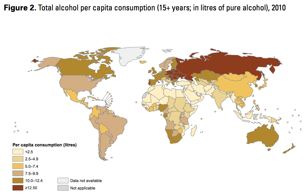
Alcohol consumption
This World Health Organization map reveals that heavy drinking is a true passion of eastern Europeans. The most teetoling countries are those with the largest Muslim populations, and, in general, poorer countries seem to drink less than richer ones. But there's no mistaking the former Soviet bloc's thirst for booze. Conversely, the United States of America is quite abstemious compared to the other English-speaking countries, with a level of alcholic consumption similar to Sweden or Brazil rather than hard-drinking Canada or Australia.Global hunger
Global hunger
This map from the Institute for Food Policy Research illustrates the world's ability (or lack thereof) to conquer the basic problem of hunger. The big picture conclusion that India and sub-Saharan Africa have more hunger than wealthier regions is not so surprising. The fact that China, despite its much-hyped recent economic growth, continues to have a bigger hunger problem than countries like Cuba or Morocco is more intriguing. Given China's enormous population and increasing prosperity, there seems to be a realistic chance to take a huge bite out of the world hunger problem if the PRC government is able to get better at feeding its people.World infrastructure map
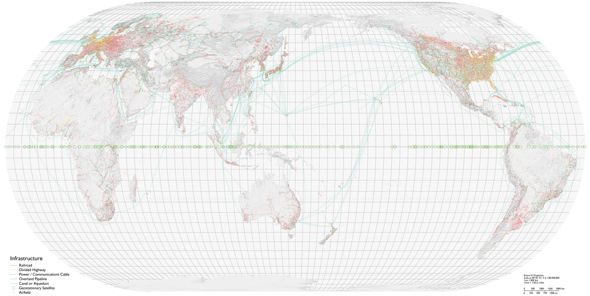
World infrastructure map
This beautiful Bill Rankin map shows every major piece of infrastructure in the world. Note the dense thicket of highways and railroads in the eastern half of the United States, and the even denser thickets covering northwestern Europe and Japan. But also note that this map highlights quantity over quality. India has what looks on paper like a very nice set of railroad lines, a legacy of British colonial rule. But the actual level of service provided by this network is relatively dismal. The map is also a way of illustrating some of the planet's vast relatively empty spaces — there's not much going on in eastern Russia or western China, even though both of these countries have plenty of infrastructure around their main population centers.

A world of regions


The sinews of trade
A world of cities

Basic commodities

People

Rich and poor


_per_capita#mediaviewer/File:Gdpercapita.PNG)
Please choose a new Vox username and password
As part of the new Vox launch, prior users will need to choose a permanent username, along with a new password.Your username will be used to login to Vox going forward.
I already have a Vox Media account!
Verify Vox Media account
Please login to your Vox Media account. This account will be linked to your previously existing Eater account.Please choose a new Vox username and password
As part of the new Vox launch, prior MT authors will need to choose a new username and password.Your username will be used to login to Vox going forward.
Forgot password?
We'll email you a reset link.If you signed up using a 3rd party account like Facebook or Twitter, please login with it instead.
Forgot password?
Try another email?Almost done,

Authenticating
Great!
Choose an available username to complete sign up.
In order to provide our users with a better overall experience, we ask for more information from Facebook when using it to login so that we can learn more about our audience and provide you with the best possible experience. We do not store specific user data and the sharing of it is not required to login with Facebook.
No comments:
Post a Comment